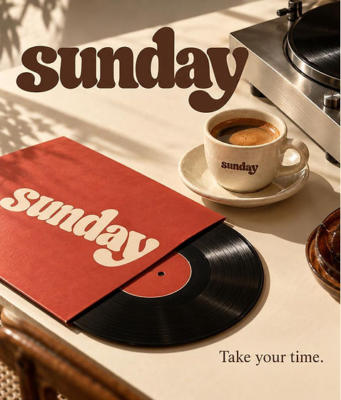
I wanted to capture a slow, rhythmic sense of leisure for this brand identity. I chose a flowing, thick, lowercase script that feels organic and connected. By placing the mark on circular vessels and rectangular records, I maintained a consistent, relaxed tone. The warm palette and soft lettering allow the business to present an identity that feels welcoming, familiar, and intentionally unhurried.
SUNDAY is a self-initiated café branding concept built around coffee, records and slow afternoons. "Take your time." The concept celebrates the pleasure of slowing down in a world that constantly asks us to do more. The visual identity combines nostalgic typography, warm cream tones, tobacco-inspired browns and tomato-red accents to establish a familiar yet distinctive café personality. The brand system explores how a consistent creative direction can extend across packaging, printed materials, merchandise and the wider café experience. SUNDAY isn't simply about coffee. It's about creating a place where people want to stay a little longer.