GIVE THE BRAND ROOM TO SPEAK. KEEP THE COLLECTION CLOSE.
An editorial storefront that brings Singaporean identity and contemporary golf wear into the same experience.
EXPLORE THE WEBSITE ↗THE QUESTION BEHIND THE BRIEF
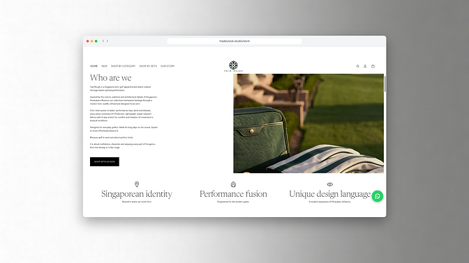
The design challenge was the balance between brand character and shopping. FAIR/ROUGH needed space to express its identity, while the products and next steps still had to be easy to find.

THE DIRECTION
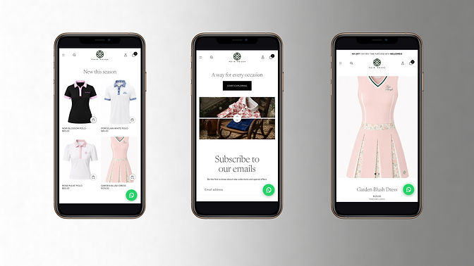
I used editorial typography, generous space and restrained layouts to let the cultural story unfold. Product-led navigation keeps the collection present within that direction.
THE DECISION THAT MATTERED
I brought complementary product recommendations into the shopping experience and refined the mobile hierarchy around imagery and essential product information. The editorial treatment had to hold up when someone was actually choosing an item.
WHAT THE DESIGN MAKES POSSIBLE
The storefront gives the brand a recognisable voice and a direct path into the collection. This is the balance I wanted: an atmosphere worth spending time in, with the practical clarity to keep exploring.
HAVE A PROJECT OF YOUR OWN?
Tell me what you’re building and what you need it to do. We can start with the part you haven’t figured out yet.
LET’S TALK ABOUT YOUR PROJECT ↗Website design and original delivered experience by MADE U LOOK. Product imagery, product information, catalogue updates and other client-managed content may be added or changed over time. Any content, visual or website changes made after handover may therefore differ from the original delivered design.